Inflation Again or Bad Math?

Last week’s economic data threw a splash of cold water on the U.S. inflation debate and interest rate picture. Both headline Producer Prices (PPI) and Consumer Prices (CPI) rose more than expected.
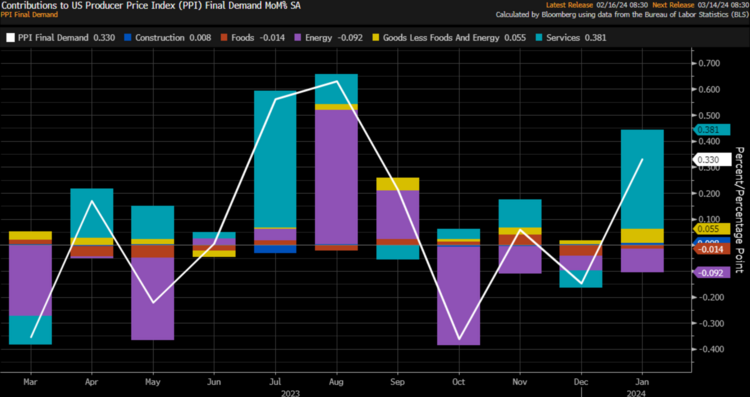
On the producer side, both food and energy prices are actually dropping, with services inflation driving most of the re-inflation. 1
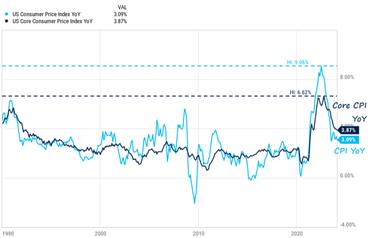
On the consumer side, inflation was higher-than-expected but continues to drop. Core consumer prices (excluding food and energy) are down to 3.09% from a high of 9.06%. That’s progress! 2
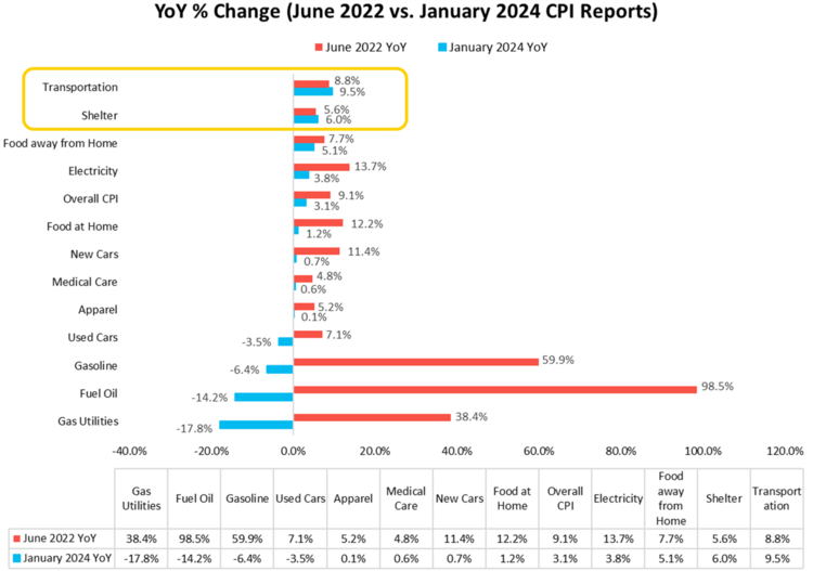
When you break down the component parts, you get an even brighter picture on moderating inflation. Only transportation and shelter costs are still on the rise. Everything else in our economy is moderating. So, let’s focus on shelter as it represents over 36% of the Consumer Price Index vs. transportation which only has about a 6% weighting. 2
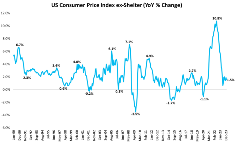
First, if you strip out the shelter component of the index you get a very different inflation picture. Inflation now looks more like 1.5% – well below the Fed’s 2% target. 2
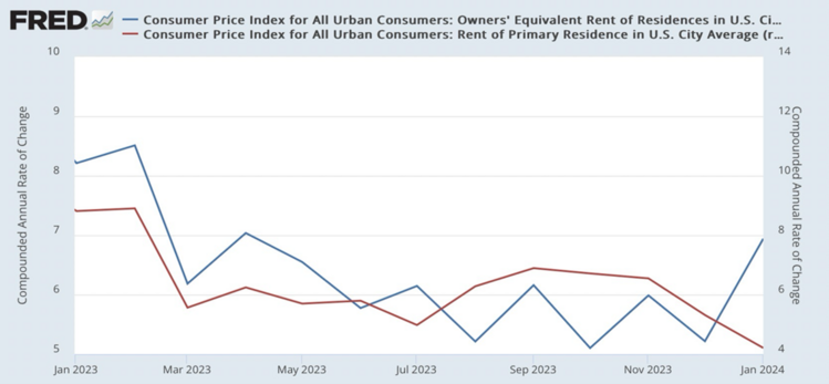
However, when adding back in shelter, rent inflation becomes a tricky calculation. It’s measured in two component parts; Owners’ Equivalent Rent (OER) and just plain rent as a primary residence. OER makes up about 27% of the 36%, while regular rent, like you pay at an apartment, makes up just under 8% of the 36%.
They tell a tale of two different stories. While plain, old-fashioned rent you pay when you rent your primary residence is declining (red); rents of Owners’ Equivalent Rent (blue) are on the rise again. 3
Leave it to big government to make something so simple to measure so complex. Or perhaps there is more lying with statistics than we all care to admit? In the case of OER – which again is 27% of the shelter component – that’s a measure of both sampling data and a survey. That’s right, a survey. The OER reflects the hypothetical rent an owner would pay if they rented their own home, not the actual cost of homeownership (which includes expenses like mortgage payments, property taxes, and maintenance). No surprise the government will never tell us the weightings of each method.
So, in effect, the biggest impact on the inflation index and interest rates right now is a survey of homeowners and what they think their crib is expected to get them if they rented it. You can’t make this up. With all the various websites and rental services online, our government chooses to use a survey of homeowners guessing at what they would get for rent.
It’s no wonder inflation looks sticky. Home prices have been on a tear for the last many years and owners would certainly expect more from their home if they rented it. Forget that their expectations have nothing to do with reality when it comes to actual rents paid. 4
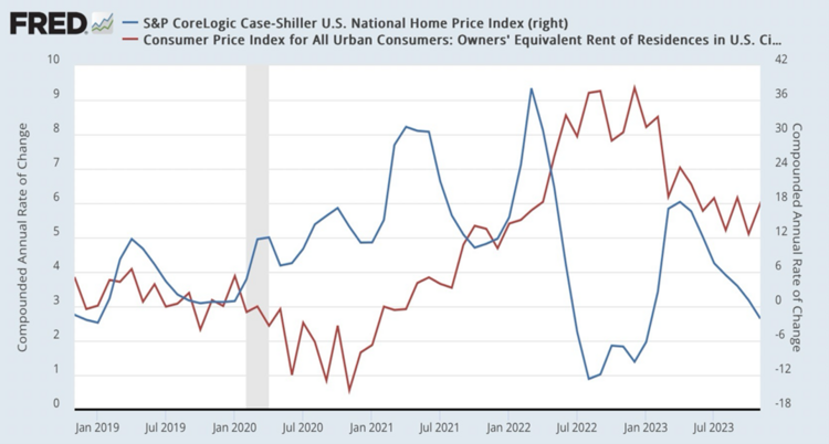
Home prices have been rising since January 2019 by around 6% a year, with a recent trend downward. No wonder homeowners think they can get more for renting out their place; the survey suggests something around 6% more each year. No coincidence.
This is how the Fed could make a mistake in keeping interest rates higher for longer. Perhaps they should either come out and say we need to hammer homeownership value, or recognize the error in the stats. Maybe they could recognize the very long lag effect between home values and what those homeowners believe they can get for rent.
Is this inflation again or simply bad math? I’m in the bad math camp and still believe this could create bad outcomes. For now, let’s keep an eye on earnings growth, consumer credit, and the real wage increases benefiting the American worker. There is no bad math in those numbers yet.
If you have questions or comments, please let us know. You can contact us via Twitter and Facebook, or you can e-mail Tim directly. For additional information, please visit our website.
Tim Phillips, CEO, Phillips & Company
Sources: