The Puzzling Effect
Albert Einstein once said, “I never think of the future; it comes soon enough.”
Despite what many think, the business of forecasting future market returns is quite precarious. For starters, forecasts are almost always wrong, especially the ones that seem to be the most precise. However, this is the business that we’re in. When clients ask (and they do), we tend to oblige knowing all too well that we’re generally setting ourselves up for some degree of “wrongness” in the process.
At the beginning of the month we gave you our Q1 2017 Look Ahead which contains some market predictions. However, one thing that we omitted was our view of the diversified portfolio and where our expectations lie in terms of 2017 returns.
While I do expect these predictions to be erroneous, directionally they should get us on base, and maybe even hit a double or triple, which can shed some critical light on an important investment term: Correlation.
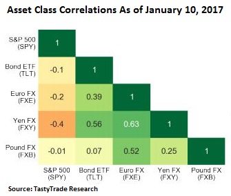 In the investment world, correlation is how two or more financial assets relate to one another. For example, how stocks and bonds move in relation to each other. If stocks and bonds are positively correlated, they will likely move in the same direction (Stocks increase, Bonds increase). If they are negatively correlated, they tend to move in opposite directions (Stocks increase, Bonds decrease, or vice versa). Correlation is always measured between -1 and +1, and all fractional numbers in between are fair game. A +1 would indicate perfect correlation, whereas a -1 would be the perfect opposite correlation. To give you an idea of how we look at correlation, take a look at the chart to the left.
Grasping the concept of correlation is critical when building portfolios in order to maximize expected returns, while still reducing risk. Correlation is especially important in times like this; notably in a year when we expect a series of interest rate increases to negatively impact bonds.
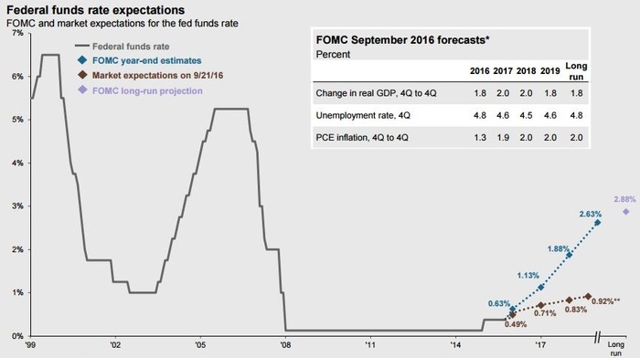
Albeit, at different trajectories, you can clearly see, in the chart below, that the Fed and market participants both expect future rate rises in 2017 and in the coming years. [i]
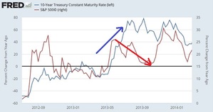
Based on chart 5 below, in measuring the correlation between stocks and bonds over the last 8 years, we can see that correlations range from being positive (moving in the same direction) some of the time, and only slightly negative (moving slightly in the opposite direction) the other part of the time.
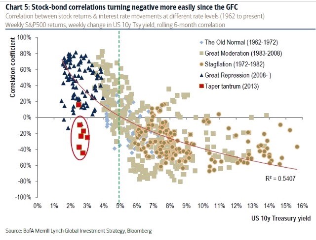
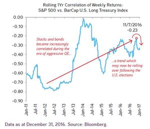
Notably, we did experience some negative correlations during the period of time when the Fed threatened to raise rates in 2013. As you can see in the chart below, stocks dropped while bond yields rose. [ii] However, for the most part, as you can see from the chart on the right, stocks and bonds have only had a slightly negative correlation to each other… Until recently! [iii]
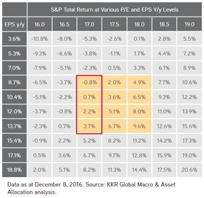
The point I’m attempting to make is that while equity returns are expected to be positive in 2017, based on the chart to my right, they are trading at higher valuations, which should put a damper on their overall average returns. [iii]
When you combine that with the continued negative correlation between stocks and bonds, we could end up seeing a pretty mediocre year for diversified portfolios. To further drive my point home, let’s take a look at the graph below which is using a 60% stock and 40% bond portfolio as a proxy. Based on the graph below you can clearly see what one Wall Street firm is expecting. [iv]
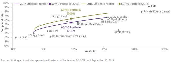
You’ll notice that for the same amount of risk, you may receive more than 1% less in overall returns compared to 2016. [iv] The diversified portfolio looks less productive due to being mostly driven by the negative correlations between stocks and bonds.
This is all great information, but how do we make use of it? What our firm is doing is actively looking for ways to reduce the impact of rising rates on the fixed income component of the portfolios we control. We’re actively looking for ways to enhance equity returns while, more notably, taking risk off the table, especially in areas like Energy and Financials.
While I understand that we’re all human and that many of us tend to size up portfolio returns with our friends, I believe it’s more important to size up the risk. Many investors that boast high rates of returns have no idea what risks are associated with their portfolio. Shamelessly, I think everyone should work with our firm, simply because it’s true; we’re here to examine your portfolio and your overall needed rate of return, and most importantly outline and manage the risk associated with those potential returns.
Thinking about the future is inevitable; being accurate is nearly impossible.
If you have questions or comments, please let us know as we always appreciate your feedback. You can get in touch with us via Twitter, Facebook, or you can email me directly. For additional information on this, please visit our website.
Tim Phillips, CEO – Phillips & Company
Robert Dinelli, Investment Analyst – Phillips & Company
References:
i. https://phillipsandco.com/files/4414/8399/3751/jp-littlebook_Q1_2017GTM.pdf
ii. https://fred.stlouisfed.org/series/DGS10
iii. https://phillipsandco.com/files/4414/8467/7300/KKR_Insights_32-170111.pdf
iv. https://am.jpmorgan.com/us/institutional/library/LTCMA-executive-summary